Thursday 15 December 2011

Week 12

 This Sketch took me 5 minutes and I believe it gives a fair example of posture and gesture of a human figure as you can see the curve of the spine. The weight of the body is focused on the spine as the figure is sitting down.


 This sketch provides a good example of gesture, the way the figure is sitting and how the weight is distributed over the left arm. I like this sketch as the gesture tells me the person is concentrated and is thinking. Figurative Gesture allows us to express ones mood whilst drawing a real life, and I believe this sketch does that quite successfully.

This is a 25 minutes sketch expressing gesture and pose. The gesture in this sketch gives a feeling of relaxation, as the figure puts his weight on his shoulders. This image is a good example of gesture and posture, it gives a good sense of life in the image just by looking at it and the posture tells us that there is a sense of weight in the figure.

Tuesday 13 December 2011

Week 11


These two quick 2 minute sketches mainly focuses on the body twist and muscle contraction. Both the images were successful in showing that body twist however the right image hasn't got the right proportion as the arms seem too short compared to the rest of the body.

Here is another quick sketch demonstrating muscle contraction and body twist. The highlights made some of the muscles stand out; the triceps muscle, calves and the back muscle. It was a quick 5 minute sketch however it does give good depth of certain body parts.

This is a 15 minute drawing where I have focused only on upper body and the muscle and bone structure. it gives a good sense of muscle on the arms and chest as well as the abdominal muscle. The highlights on the chest allowed the ribs to stand out.

This Last drawing took me 15 minutes. For this specific drawing I focused on lower leg muscles, and this image was very successful in doing that as I have highlighted the calves giving it a good tonal value which made the muscle structure stand out. The shading on the foot allowed me to make the wrinkles more visible, this made it more obvious that it was the left leg.

Sunday 4 December 2011

Week 10

This quick 1 minute sketch represents Gesture drawing as to how the body parts move as the person keeps changing positions. I really enjoyed this technique as it allowed me to look at body parts individually whilst the person was moving giving me the sense of urgency. Even though the sketch is not very clear however it does convey the idea of movement.

I chose to post week 9s sketch on this weeks blog as it represents a sort of movement. This technique is called continuous line drawing which I believe is best for showing movement. Good representation of movement however this sketch failed to produce the right body proportion as the size of legs seem to be out of proportion compared to the rest of the body. I personally prefer this technique for loosening up my hands.

Here is a quick 5 minute Sketch of male human anatomy. What I like about this drawing is the body posture as it seems straight however the proportion isn't correct as the arms and legs are too short for the rest of the body.


This drawing took me 10 minutes. What I like about this sketch is the correct proportion of the figure and the shading technique used for the cloth as it gives a good idea of the material and the folds are quite visible. However there is a fault in the posture of this figure as the spine does not lie in the correct place and neither it meets the back of the skull. 

Thursday 1 December 2011

Week 9


This first drawing consists of 4 drawings a minute each. Despite the short time I was still able to represent skeletal and muscular anatomy of the figure. The drawings are successful in giving a nice sense of mass however it failed to illustrate the body proportions.


I chose to draw my own hand in these two perspectives to give a contrast between their volume from different angles. Both drawings give a good idea of muscle structure, however it fails to provide a good bone structure as the knuckle joints are in a straight line rather than being slightly bend. Each drawing took me 15 minutes.


This is a 15 minute life drawing of a human anatomy. The drawing is successful in representing a human figure but  the posture doesn't seem right as the derriere doesn't actually meet the spinal cord and also the body proportionality of the figure isn't correct as I made the thighs too long. Despite that the shading helped quite a lot to differentiate between the subject and the material. I used hatches and cross-hatches to get the right tonal value.

Sunday 20 November 2011

Week 8

The image above shows the contrast between a plastic computer mouse and a glass perfume bottle. For this particular drawing I decided to go for monotone drawing and only used brown coloured pencil. Here I've shown a good comparison between a glass and plastic; glass which is see-through and most of the lights can pass through which makes it a good reflector, whereas the plastic doesnt allow any light to go through hence poor reflectivity. However they both produce some light and dark tonal values. The glass causes diffuse reflection due to bumpy surface whereas the plastic mouse which has a smoother surface causes specular reflection.

Here is another example of me demonstrating surface reflectivity. I chose to draw my headphones as it had a smooth polished finish to it's ear pieces, which can be another good example of specular reflection, this specularity is shown in the ear shell of the headphones. By using a fine liner I was able to create a better contrast between light and dark regions by using hatches and cross hatches technique. As you can see the ear pieces have reflected lights on certain parts.
For both of these drawings I switched off the lights and turned on a side lamp to get a better view of the reflectivity.

Thursday 10 November 2011

Week 7


I did these two quick drawings just to familiarise myself with the tone and texture of the object, the first drawing was with pencil and took me 5 minutes and the second drawing was with charcoal which took me about 7 minutes. For my second drawing I did not use any lines for the edges but only shading to make certain parts stand out. This technique worked really well with the charcoal as its easy to get that dark regions and by using a putty rubber I created some light patches. I personally preferred this technique as it was much more fun and professional.


This drawing consists of number of different object with different sizes, shape and texture. This drawing is done all by using charcoal and I used the same technique on the big object as my previous drawing with no lined edges, this took me about 40 minutes. I was very pleased with the outcome of that technique, the jar is solid and reflective and I showed this by the tone of my shading. The glass bottle was see-through so I used the side of my pencil to give it that reflective, glassy tone. During this session I learnt a number of different techniques to differentiate between various objects.


Another one of my drawings made by only using a B and 5B pencils which took me about 20 minutes. The idea of this drawing is to give me a good view of texture and surface. The drawing consists of 3 solid objects, 2 of which is metal and 1 is glass. The jug had a reflective surface as you can see objects on the surface of the jug where as the ball on the side was a solid glass with a slight see-through surface. Again I used different tonal value to give mass and depth to all these objects.

Tuesday 8 November 2011

Week 6

On this week's drawing I mainly focused on shading and texture. It took me about 35 minutes to do this drawing. It is vital to get the dark and light patches correct so I used B, 3B and 6B pencils. Using the side of the pencil technique allowed me to get that light/dark rough shading on the flower which turned out really well, the cloth itself was pretty much straight forward as one side was a lot darker than the other due to the light hitting the surface, so I had to use 6B to get that dark shading. The fact that I drew the 2 spot lights gave a good idea of the composition. The flower jar was a solid object so I mainly used dark shading to show that whereas the cloth was more smooth surfaced for which I used both high key and low key. 

 Here is a another drawing of a solid plastic object, this took me roughly about 30 minutes. The object is pretty much plane but there is still some reflection on the surface which I showed it by light shading. I mainly focused on the texture of the object this time which was smooth and a semi reflective. I achieved that semi-reflective look by using the side of my pencil and doing some light hatching and crosshatching shading.

Week 5


This is a 15 minute drawing. I chose to draw this building due to the perspective and the different interpretation as to which you can draw this building. Whilst drawing this particular piece I focused on how to make the building look realistic. I think this drawing was unsuccessful in conveying a one point perspective drawing however it was successful in representing the main structure of the building.


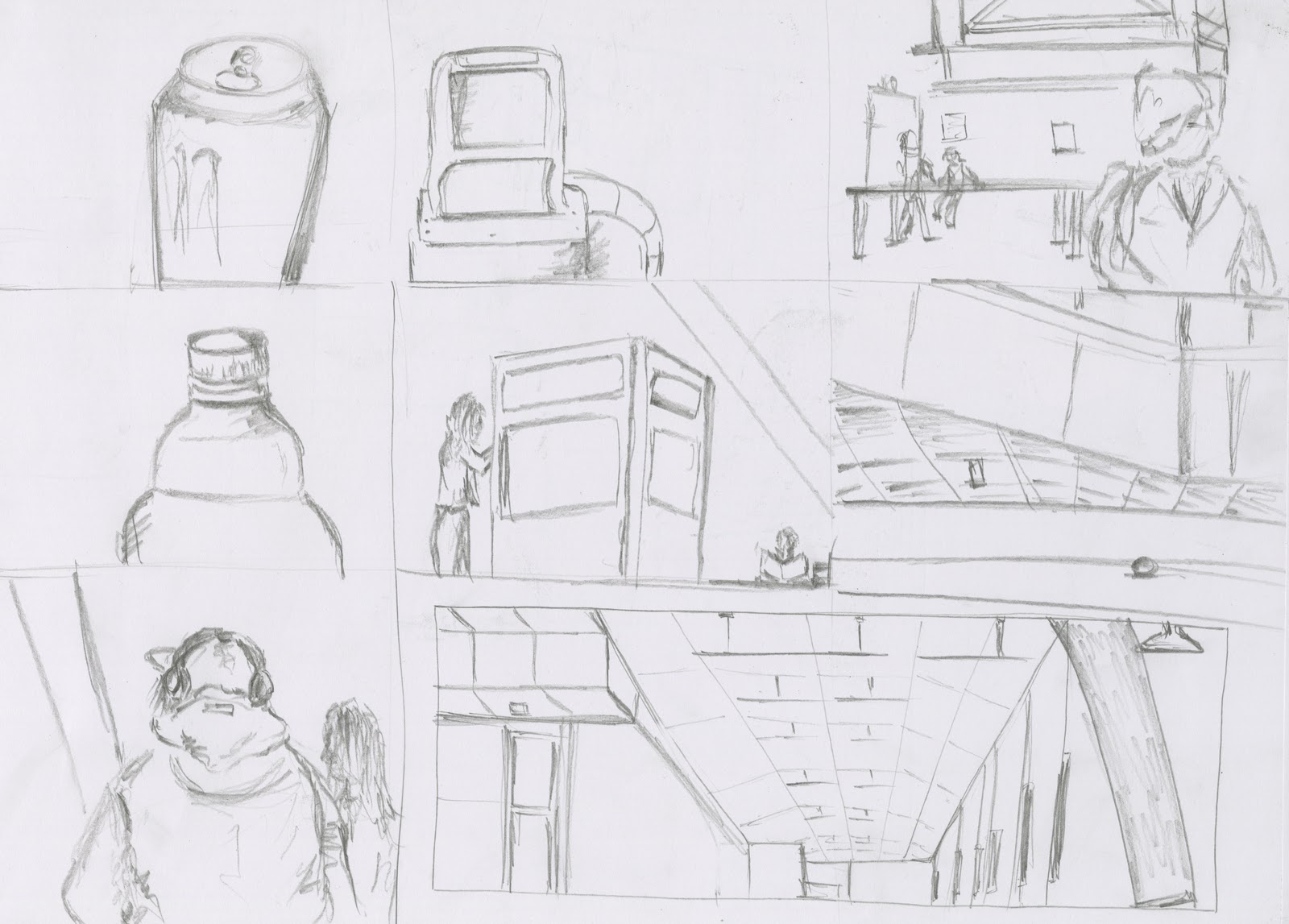
This sketch took me 10 minutes. This sketch shows a good value of composition  because the focus is not based on the center of the image thus following the rule of third. Also this sketch gives a sense of depth as to where each object lies.

This particular drawing took me 10 minutes. What I like about this drawing is that it gives a good outline of the structure however it is unsuccessful in giving a sense of realism in the subject. I used the impressionistic technique on the bricks in this drawing to give a broad idea of what is there.

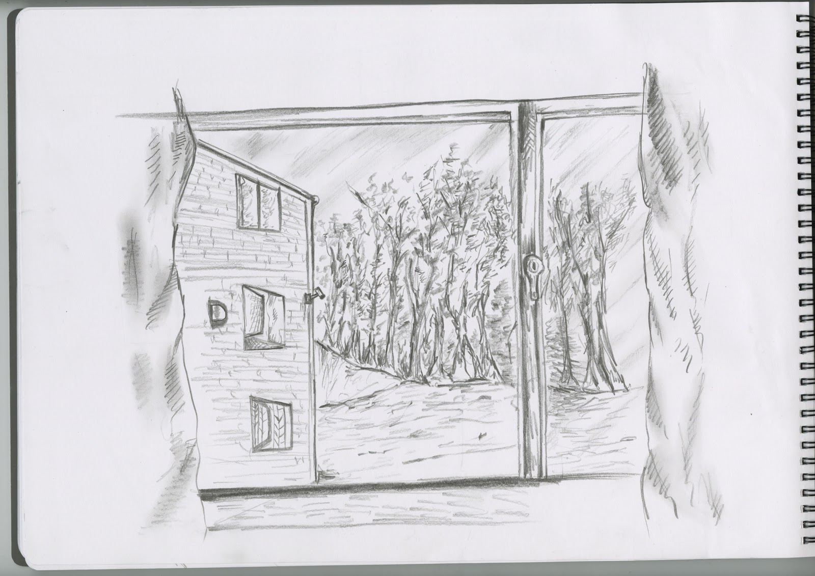
Here in this drawing I have used the one point perspective rule to create one of the buildings. It also gives an idea of composition as I have drawn the foreground, midground and the background to give a better sense of distance.


I used fine liner specifically for this drawing to get a better definition of the lines. For this drawing I have mainly used linear lines to represent the shading as well as the structure. Using the impressionistic technique I was able to create an illusion of the bricked wall, without me having to draw every single brick individually. This drawing took me 25 minutes.

Sunday 23 October 2011

Week 4

This drawing shows a quick sketch of a towel hanging off a hanger, it took me about 4-5 minutes to do this. I did this sketch just to practice the lighting and the texture of the material. This drawing has both smooth and rough shading in order to emphasis on certain parts of the towel.

This drawing on the other hand has more of a rough shading compared to the last one, this one took me about 10 minutes to draw using 5B pencil. As you can see it gives us a rough idea of the type of material just by looking at the shading; dark and light regions, and where the folds are. I have used crosshatching shading effect just to make certain parts darker.

This drawing gives a much better idea of lighting and texture, this took me about 20 minutes. I have created nice and smooth curves using just 5B pencil either using the tip of the pencil or the side depending what region I'm shading. I have also used some basic shading effect such as hatching, crosshatching just to give it that extra texture and it certainly did work well for me as it made some of the folds stand out. The smooth and rough shading effect gave a volume to the object and it does look like its spreading on some other object underneath it.

Saturday 15 October 2011

Week 3

This is a simple sketch of Richmond Building, I did this only by using 4B pencil and it took me about 20 minutes. I did this sketch just to give me a rough idea of where things lie in a picture; the fore ground which is the big metal University of Bradford symbol, the mid ground is the people moving around and the background is the Richmond building itself. This shows a rough idea of composition and how each object are arranged in a different way. The focal point of this image is the metal at the foreground. If I were to do this sketch again I'd make sure I shade each region based according to their spacing in order to make them stand out and it'll be easier to distinguish between each region.

Here I have got another example of composition from different angle and it took me about 25 minutes. I've done quick sketches of 7 different objects and places, close and far. This gives me a good idea of composition and how the size of an object changes depending on where it lies within that image, as shown on ma 3rd image where the fore ground is the person, the mid ground is people by the lift and the background is the lift itself showing different arrangement of objects, the focal point in that drawing is the person at the front which draws attention.

Sunday 9 October 2011

Week 2

The view through my bedroom window. As I was sitting on my laptop I opened my curtains and liked the view so I started to observe everything infront of my window and then I started sketching whatever I saw, started off with the building and ending on the window frames. This drawing was done using B,2B,and 6B  it took me roughly about 30 minutes and is mainly based on organic shapes around us. The main point about this drawing is that It gives a good idea on a perspective view as I captured a 3D environment onto a 2D plane. My horizon line is the line just below the trees and this is pretty much a single point perspective. The vanishing point lies in the center of the image and on top of the tallest tree. I used 6B for shading the tree as it makes certain branches stand out, giving it life!  
I like this drawing and that is because it feels as if its alive and looking back at you, I believe it is due to the technique I've used for the shading which really helped specific objects to stand out.

However if I was to do another similar drawing I would make sure that I get all the angles right and practice more on my perspective drawing.

Saturday 8 October 2011

Week 1


 In this drawing I have only experimented with different sketching pencils and just to find out the difference between a light B pencil and a very solid dark pencil 6B showing all the high key and low keys. I have also practiced some simple line qualities and basic geometric shapes as to remind myself of all the techniques used in drawing.

A simple black and white drawing made using B, 3B and 6B pencil which took me about 35 minutes. This drawing mainly identifies the basic geometric shapes of different objects. Firstly I did a plan sketches of all the three objects then when I was happy with it I started shading . The purpose of this drawing is mainly to show shapes, lines and how these are affected when hit by some light causing dark and light patches all showing the shape and depth of each of object. I gathered some random objects from around the room and started drawing, I started off with the furthest object and getting closer showing a good view of perspective. The drawing shows posture of 3 different materials; plastic, glass and clay.All these objects are affected in a different way when light is lit, the glass shows some reflection and some light shades at the bottom, which is quite similar to the bottle of water, however mug showed different shading pattern, it showed some bright and some very dark solid shades.
By drawing these objects I found out how objects made up of different material is affected by light.